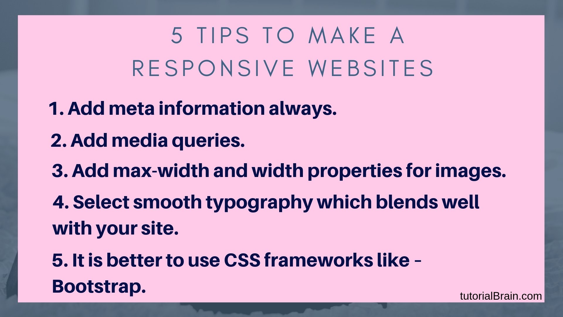
HTML Responsive Web Design
Responsive web design means the website should be responsive in all the devices like Desktop, Laptop, iPhone, Android, tablets etc.
The website should adjust properly in all the devices as per the shape and size of the devices. A responsive website will look good and attractive in all the devices and none of the links, images, fonts etc should break while the website is seen from any devices.

Using CSS and HTML we can create a responsive web page.
Note/suggestion/improvement:
You can use width:100% for the images in the style attribute to make the image responsive.
Example for Responsive Image
<meta name="Birds Image" content="width=device-width, initial-scale=1.0">
<body>

<h2>Example for Responsive Image</h2>
<img src="https://preview.ibb.co/caDh30/bird3.jpg" style=" width:100%;">

</body>
Example for Responsive Font Size
<meta name="viewport" content="width=device-width, initial-scale=1.0">
<body>

<font color =green>
<p style="font-size:5vw;">HTML Responsive Web Design</p>
<p style="font-size:4vw;">Create Responsive Text </p>
<p style="font-size:2.5vw;">vw is unit used to increase the text size where 1vw=1%</p>
</font>

</body>
Example for Responsive Page
<head>
<meta name="viewport" content="width=device-width, initial-scale=1.0">
<style>
* {
box-sizing: border-box;
}
.menu {
float:left;
width:25%;
text-align:center;
}
.menu a {
background-color:coral;
padding:6px;
margin-top:12px;
display:block;
width:100%;
color:Black;
}
.main {
float:left;
width:55%;
padding:0 20px;
}
.right {
background-color:coral;
float:left;
width:20%;

padding:20px;
margin-top:7px;
text-align:center;
}

@media only screen and (max-width:650px) {
.menu, .main, .right {
width:70%;
}
}
</style>
</head>
Interview Questions & Answer
Responsive web design means the website should be responsive in all the devices like Desktop, Laptop, iPhone, Android, tablets, etc.
The website should adjust properly in all the devices as per the shape and size of the devices. A responsive website will look good and attractive in all the devices and none of the links, images, fonts, etc should break while the website is seen from any devices.
A viewport is the area of a web page in which the content is visible to the user. It varies with the variation in screen size of the devices on which the website is visible.
For example, For a desktop, the viewport has a larger size as compared to a phone or tablet.
Syntax:-
<meta name="viewport" content="width=device-width, initial-scale=1.0">