Opacity CSS

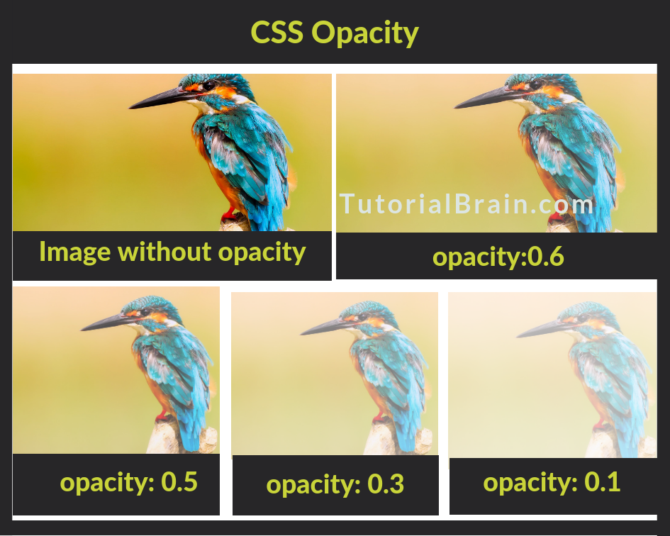
Opacity is the degree of transparency of an element.
- The Opacity takes a value between 0 to 1.
- The default value of opacity is 1.
- The Opacity value of 0.5 is called Translucent.
In modern browsers or the latest version of browsers, you can simply use the property with the name as opacity to set the degree of transparency.
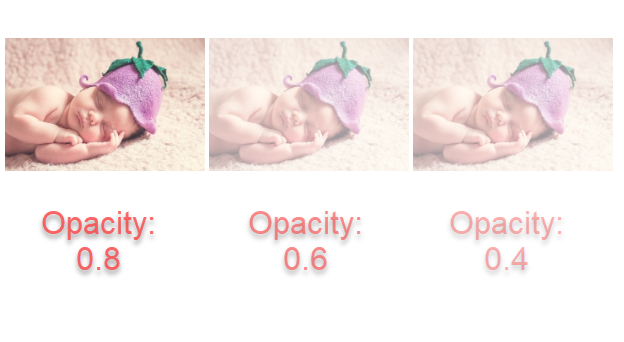
The transparency is inversely proportional to opacity which means if you have a lesser value of opacity, then the image is more transparent. Similarly, if you have a larger value of opacity, then the image is less transparent.
Syntax of Opacity for Modern Browsers:
Opacity: value(between 0 to 1)
Using Opacity for Images
The most basic way of setting a transparent element is by using the opacity property of CSS.

Cross Browser Opacity
The opacity property in most of the modern browsers works fine without any issues. But, IE8 and prior versions are not compatible with the opacity property, hence opacity is not a standard property for IE 8 and previous versions.
Instead of opacity property, the older version of Internet Explorer-8 i.e (IE 8) uses –
-ms-filter: "progid:DXImageTransform.Microsoft.Alpha(Opacity=50)";
IE 5 – IE 7 uses –
filter: alpha(opacity=value);
So, if the opacity is 0.4 then the value will be 40 i.e.
filter: alpha(opacity:40);
Apart from IE, the Netscape Browser is also not fully compatible with this property, so the syntax for Netscape browsers is like –
-moz-opacity: 0.4;
Example for Cross Browser Opacity
Example of Cross Browser Opacity
h3{background:gold;
  font-size:4vw;}
.opacityval {
  -khtml-opacity: 0.4;  /* Safari 1.x */
  -ms-filter: "progid:DXImageTransform.Microsoft.Alpha(Opacity=50)"; /* IE 8 */
  filter: alpha(opacity=40); /* IE 5-7 */
  -moz-opacity: 0.4; /* Netscape */
  opacity: 0.4; /* Popular browsers */
  }
CSS Opacity on Image Hover
In case, the user wants to mouse over an image and the user wants the image to either be more transparent or less transparent, then you can use opacity on image hover.
Hover on image to change its opacity

CSS Opacity for div background color
The opacity allows the div to be more transparent div.
The opacity can be even used in the same way for the section as well.
div without Opacity
- HTML
- CSS
- JAVA
div with Opacity
- HTML
- CSS
- JAVA
CSS Opacity for Background Image
The opacity property can also set the Background image to be transparent.
Example of Opacity for Background Image
div{width:1000px;
    height: 400px;
    background: linear-
    gradient(rgba(255,255,255,.3),
    rgba(255,255,255,.4)), url("img/nature-girl-tiger.jpg");
    }
Changing background opacity using RGBA
The RGBA property is also a popular way to make an image transparent.
- R – Stands for the amount of Red
- G – Stands for the amount of Green
- B – Stands for the amount of Blue
- A – Stands for Alpha which is the opacity.
The Syntax of opacity using RGBA:
rgba(rr,gg,bb,a)
where –
rr – Red
gg – Green
bb – Blue
aa – Opacity
Example of background opacity using RGBA
.rgba-opacity{
 width:350px;
 background: rgba(80, 160, 300,0.2);
 display: inline-block;
 color:black;
 padding:15px;
}
CSS Text Opacity using RGBA
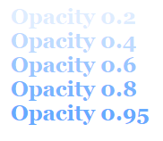
Let us see how the Text will look when you change the transparency of the texts using different RGBA values.

Example of Text Opacity using RGBA
.textopa{
   display: inline-block;
   padding:15px;
   font-size:1.5em;
   font-family:georgia;}
.textopa.t1 {
   color: rgba(80, 160, 300, 0.2);
   }
.textopa.t2 {
   color: rgba(80, 160, 300, 0.4);
   }
.textopa.t3 {
   color: rgba(80, 160, 300, 0.6);
   }
.textopa.t4 {
   color: rgba(80, 160, 300, 0.8);
   }
Applying Opacity on Texts inside an Image
The opacity property can also help the texts to blend with an image.
In the below example, the texts are blending nicely with the background nicely.
div with opacity property
Text blends well with image and text is transparent
Example of Text Opacity inside Images
section.bgval {
  background:url(img/nature-girl-tiger.jpg);
  border: 2px dashed #BC7BB3;
  padding:40px;
}
.without-opacity {
  background-color: #eff1f4;
  padding:15px;
}
.with-opacity {
  background-color: #eff1f4;
  padding:15px;
  opacity:0.5;
}
There are other ways to make the texts transparent and blend with images.
An important way is to use transform property along with opacity. The transform property helps to transform an element like –
- Moving of element
- Rotating the element
- scale elements around Y or X axis
- skew (to distort) an element
In the below example, we will move the div (which contain texts) inside the image using the translate(x,y) property of transform like –
transform: translate(1px,-30px);
- translate(1px,px) – Move 1px towards the right side along x axis and 2 px towards the bottom from the Y axis.
- translate(10px,-150px) – Move 10px towards the right side along x axis and 150px towards the top from the Y axis.
Example of Text in Transparent Box inside an Image
.transbox1{background: rgba(13, 14, 10, 0.5);
          color: yellow;
          transform: translate(1px,-170px);
          height:100%;
          width:100%;
          }
Opacity: Text in Transparent Box
Here is an example for text in transparent box:
Example of Opacity Text in Transparent Box
<!DOCTYPE html>
<html>
<head>
<style>
 div.bgval {
  background-color:black;
  border: 5px dotted aqua;
  padding:40px;
 }

 div.squarebox {
  background-color: white;
  padding:15px;
  opacity: 0.7;
 }

 bgval.squarebox h1 {
  margin: 6%;
 }
</style>
</head>
<body>

<div class="bgval">
<div class="squarebox ">
<h4>Text inside a transparent box</h4>
</div>
</div>

</body>
</html>
Opacity Transition
The opacity property in CSS also allows you to transition from one value to other value once the elements change from one state to another.
For Example:
You can change the transparency of an image once the user clicks on it.
Example of Opacity Transition on Mouseover
.transition1 {
     width: 60px;
     padding: 60px;
     background: Turquoise;
     opacity:0.5;
}
.transition1:hover {
     opacity:1;
}