CSS Grid
We have tried to prepare a comprehensive CSS Grid tutorial.
CSS grid is one of the most important topics in CSS, hence we have tried our best to provide a clear & concise tutorial on grids.

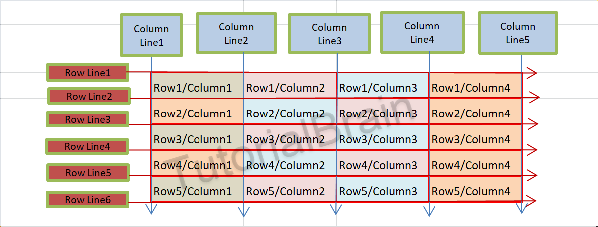
The Grid in CSS is a collection of Rows & Columns which are divided into Grids. So, Grids are basically the intersection of Horizontal & Vertical Lines.
The starting point of CSS Grid is the Grid Container.
So, Grid container is a way to contain HTML elements in Grid form.

CSS display grid
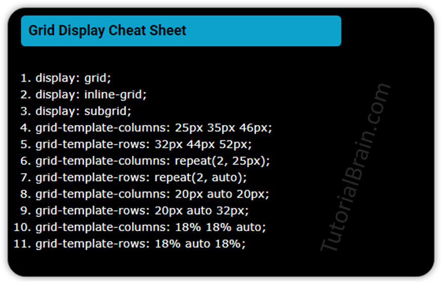
First, we need to tell the browser that we are trying to display an element as Grid. To display an element as Grid, you need to use display: grid property or display: inline-grid property.

Syntax of CSS display Grid:
display: grid;
display: inline-grid;
You can use any one of the above to display an element as Grid.
Note/Info:
If you set an element as Grid Container, then all the elements under this element automatically become Grid items.
Example to CSS display an element as Grid
.container {
  display:grid;
  background:orange;
  border:2px solid green;
}

.inner-divs {
  padding: 2px;
  background:aqua;
  border:2px solid green;
}
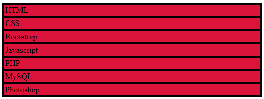
Now, even though you made this entire div as a grid container, the output does not change.
This is the same output you get without making it a grid container but the most important difference is that all the elements inside this “container” class are grid items which you can use further.
Note/Info:
It is always important to set display: grid or display:inline-grid to make the element as a grid container. So, to use grids, you should always use the statement display: grid or display:inline-grid along with other properties which we are going to discuss now.
After you define the elements as a grid container, you have to define the number of columns and the number of rows that you want in your grid container.
The CSS display grid template property sets the number of columns & rows in the grid.
Grid template columns
The CSS grid-template-columns property performs 2 functions-
- It controls the number of columns in your grid container.
- This sets the width of each column.

The output of the below example will overflow in Mobile devices as we have not applied responsive web design concepts so please do not worry at this point of time.
You will eventually master the concepts of making a website responsive.
Example of display Grid to set different width of columns
.container-template-columns {
  display:grid;
  grid-template-columns: 140px 120px 100px 160px;
}

.inner-divs {
  padding: 2px;
  background:aqua;
  border:2px solid green;
}
In the above example, you have 8 items. so, the 1st 4 items will be in the first 4 columns in the first Row and the remaining 4 items will adjust automatically in the 1st, 2nd, 3rd & 4th Column of the 2nd Row.
Also, the width of the columns as set by grid-template-columns will be:
- 1st column is 140px
- 2nd column is 120px
- 3rd column is 100px
- 4th column is 160px
Now, if you want the browser to automatically assign equal width to all the columns, then you use the keyword “auto” for all the columns as below.

Example of display Grid to set the same column width
.container-template-columns-auto {
  display:grid;
  grid-template-columns: auto auto;
}

.inner-divs {
  padding: 2px;
  background:aqua;
  border:2px solid green;
}
You can assign a fixed width to particular columns and automatically calculate the width of other columns using “auto”.
Refer to the below example –
Example of display Grid to set a fixed width and automatic width
.container-template-columns-auto-fix {
  display:grid;
  grid-template-columns: 80px auto 140px auto;
}

.inner-divs-auto-fix {
  padding: 2px;
  background:aqua;
  border:2px solid green;
  text-align:center;
}
In the above example, the widths of each column as set by grid-template-columns as:
1st column is 80px.
2nd column is auto.
3rd column is 140px.
4th column is auto.
Note/Info:
If you do not define the number of rows explicitly, then by default once the 1st row is filled, it will automatically increment the number of rows and the remaining grid items will flow to the next rows.
Grid template rows
The CSS grid-template-rows property performs 2 functions-
- It controls the number of rows in your grid container.
- This sets the height of each row.

Example of display Grid to show grid template rows
.container-template-rows {
  display:grid;
  grid-template-columns: 80px auto 140px auto;
  grid-template-rows: 100px 50px;
}

.inner-divs1 {
  padding: 2px;
  background:yellow;
  border:2px solid green;
  text-align:center;
}
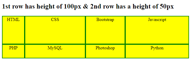
So, in the above example, there are 2 rows. The 1st row has a width of 100px while the 2nd row has a width of 50px.