CSS Animations
The CSS Animations helps to animate an element from one style to another style. Basically, the element transitions from one style form to another style form using animation.
The CSS animation can easily achieve a similar functionality without using the JavaScript. The performance of CSS animation is better compared to JavaScript animation.
If the browser loading speed is slow, CSS Animations loads faster than JavaScript animations.
Hover to Animate
How to create Animations
Step1 – Select the element and apply the style on the element. This is the default style before or after animation. You should keep the name of the animation using the animation-name property. You can also apply other animation relation properties which we are going to discuss here.
Step2 – Use @keyframes followed by the animation name which is defined in the previous step. The @keyframes property changes the structural form of the element from one style form to another form which appears like a sequence of events.
Animations Keyframes
The @keyframes property performs the actual animation in a sequential manner.
In simple terms, it sets a particular style at the start and it changes the animation after some intervals. It keeps on following this until the end of the sequence.
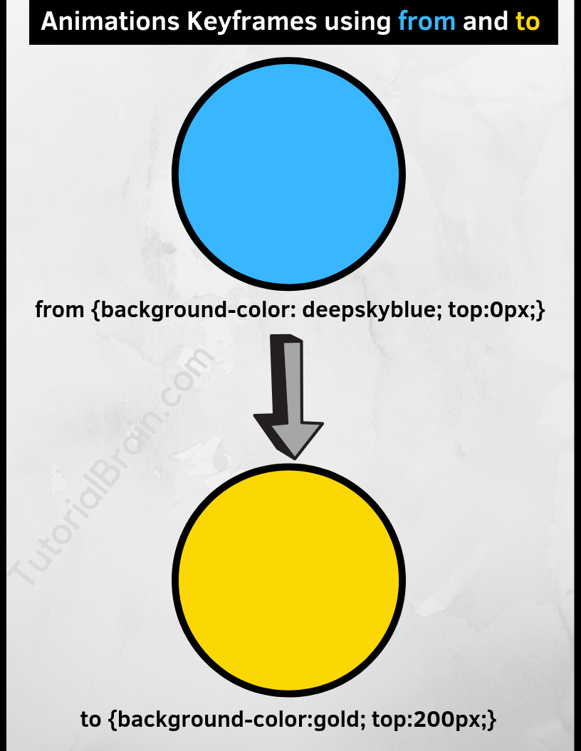
The Syntax of Animations Keyframes(using from and to):
@keyframes name-of-animation {
from { style1… }
to { style2… }
};
from – Start of the animation(0%)
to – End of the animation(100%)
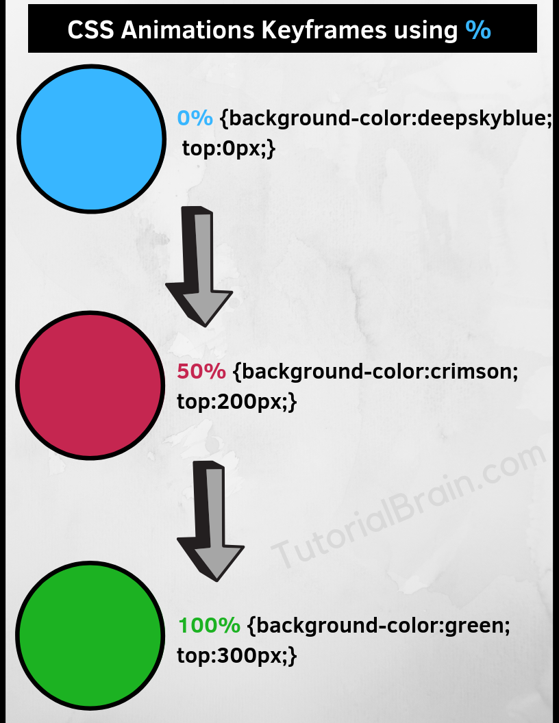
The Syntax of Animations Keyframes(using %):
@keyframes name-of-animation {
a% { style1… }
b% { style2… }
c% { style3… }
…
…
n% { stylem… }
};
Here,
a, b, c & n can be a number which can range from 0 to 100
Example of Animations Keyframes using from and to
.animation-from-to {
 border:2px solid black;
 position:relative;
 width:200px;
 height:200px;
 border-radius: 100%;
 background-color:deepskyblue;
 -webkit-animation-name:ex1-keyframerules-from-to;
 animation-name:ex1-keyframerules-from-to;
 -webkit-animation-duration:4s;
 animation-duration:4s;
}

@keyframes ex1-keyframerules-from-to {
 from {background-color:deepskyblue; top:0px;}
 to {background-color:gold; top:200px;}
}

@-webkit-keyframes ex1-keyframerules-from-to {
 from {background-color:deepskyblue; top:0px;}
 to {background-color:gold; top:200px;}
}
Example of Animations Keyframes using %
.animation-ex1 {
 border:2px solid black;
 position:relative;
 width:200px;
 height:200px;
 border-radius: 100%;
 background-color:deepskyblue;
 -webkit-animation-name:ex1-keyframerules;
 animation-name:ex1-keyframerules;
 -webkit-animation-duration:4s;
 animation-duration:4s;
}

@-webkit-keyframes ex1-keyframerules {
 0% {background-color:deepskyblue; top:0px;}
 50% {background-color:crimson; top:200px;}
 100% {background-color:gold; top:0px;}
}

@keyframes ex1-keyframerules {
 0% {background-color:deepskyblue; top:0px;}
 50% {background-color:crimson; top:200px;}
 100% {background-color:gold; top:0px;}
}
Various Animation properties.
The animation-name and @keyframes are the most important properties in animation. Apart from these 2 properties, there are other important properties as well –
- animation-duration – Duration of Animation
- animation-delay – Animation to be delayed
- animation-timing -Timing of the animation
- animation-direction – Direction of Animation
- animation-fill-mode – What needs to be done before the animation starts or after the animation ends
- animation-iteration-count – Number of Animations in a Loop
- animation-play-state – To control whether to play or pause the Animation
- animation – Shorthand animation property
1. Animations Duration
The animation-duration controls the amount of time for the animation. The default value of animation-duration is 0 seconds.

The Syntax of Animation Duration:
animation-duration:ns;
Where ‘n‘ can be any number with or without a decimal
Example:
animation-duration:2s; /*animation duration is 2 seconds */
animation-duration:3.5s; /*animation duration is 3.5 seconds */
Example of Animations Duration
img {
  width:200px;
  height:200px;
  border-radius: 100%;
  -webkit-animation-name:val1-duration;
  animation-name:val1-duration;
  -webkit-animation-duration:5s;
  animation-duration:5s;
}

@-webkit-keyframes val1-duration {
   0% {transform:rotate(90deg)}
  100% {transform:rotate(360deg)}
}

@keyframes val1-duration {
   0% {transform:rotate(90deg)}
  100% {transform:rotate(360deg)}
}
2. Animations Delay
Suppose, you want to start your animation after some delay, then you can use the animation-delay property.
Hover your mouse over the below image and you will notice that the image starts animating after a delay of 1 second.
The Syntax of Animations Delay:
animation-delay:ms;
Where ‘m‘ can be any number with or without a decimal
Example:
animation-delay:3s; /*animation will delay after 3 seconds from start */
animation-delay:4.5s; /*animation delay is 4.5 seconds */
Example of Animations Delay
.main-val {
   width:150px;
   border:2px solid black;
   background:hotpink;
   height:100px;
   -webkit-animation-name:val1-delay;
   animation-name:val1-delay;
   -webkit-animation-duration:3s;
   animation-duration:3s;
   -webkit-animation-delay:2s;
   animation-delay:2s;
}

@-webkit-keyframes val1-delay {
   0%  {width:150px;}
   50% {width:250px;}
  100% {width:300px;}
}

@keyframes val1-delay {
   0%  {width:150px;}
   50% {width:250px;}
  100% {width:300px;}
}
3. Animation Timing Function
The animation-timing-function property sets how the animation should progress from start to end like what is the speed –
- at the start
- in different phases
- at the end
This animation-timing-function can take any one of the listed values below –
- linear
- ease
- ease-in
- ease-out
- ease-in-out
- cubic-bezier(a,b,c,d) – Where a and c will be between 0 to 1.
The Syntax of Animations Timing-Function:
animation-timing-function: linear| ease| ease-in| ease-out| ease-in-out| cubic-bezier(a,b,c,d);
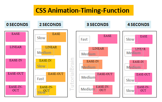
Example of Animations Timing-Function
div {
  position:relative;
  width:100px;
  text-align:center;
  border-radius:5%;;
  background:hotpink;
  height:50px;
  -webkit-animation-name:animation-function-val;
  animation-name:animation-function-val;
  -webkit-animation-duration:6s;
  animation-duration:6s;
}
.ease{animation-timing-function: ease;}
.linear{animation-timing-function: linear;}
.easein{animation-timing-function: ease-in;}
.easeout{animation-timing-function: ease-out;}
.easeinout{animation-timing-function: ease-in-out;}

@-webkit-keyframes animation-function-val {
    0% {left:0px;background-color:gold;}
   100% {left:200px;background-color:hotpink;}
}

@keyframes animation-function-val {
    0% {left:0px;background-color:gold;}
   100% {left:200px;background-color:hotpink;}
}
Animations Fade in
Use animation-timing-function:ease-in property to create a Fade-In effect.
Example of Animations Fade in
div {
   position:relative;
   background:linear-gradient(cyan, dodgerblue);
   width:200px;
   height:100px;
   -webkit-animation-name:val-fadein;
   animation-name:val-fadein;
   -webkit-animation-duration:5s;
   animation-duration:5s;
   animation-timing-function:ease-in;
}

@-webkit-keyframes val-fadein {
   0% {left:0px; opacity:1;}
   100% {left:200px; opacity:0;}
}

@keyframes val-fadein {
   0% {left:0px; opacity:1;}
   100% {left:200px; opacity:0;}
}
4. Animations Direction
The animation-direction sets the direction of the animation & it can take any one of these 4 values –
- normal – This is the default direction which is always in forwards direction.
- reverse – This is the reverse of the default direction. It means the direction will be backwards.
- alternate – First, the animation goes to forward direction in one cycle & then in backward direction in the next cycle.
- alternate-reverse – First, the animation goes to the backward direction in one cycle & then in forward direction in the next cycle.
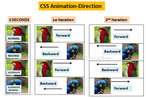
The Syntax of Animations Direction:
animation-direction:normal| reverse| alternate| reverse
Example of Animations Direction
img {
 position:relative;
 height:100px;
 -webkit-animation-name:val1-direction;
 animation-name:val1-direction;
 -webkit-animation-duration:4s;
 animation-duration:4s;
 animation-iteration-count:2;
 -webkit-animation-iteration-count:2;
}
.normal{animation-direction: normal;}
.reverse{animation-direction: reverse;}
.alternate{animation-direction: alternate;}
.alternate-rev{animation-direction: alternate-reverse;}

@-webkit-keyframes val1-direction {
 from {left:0px;}
 to  {left:200px;}
}

@keyframes val1-direction {
 from {left:0px;}
 to  {left:200px;}
}
5. Animations Fill Mode
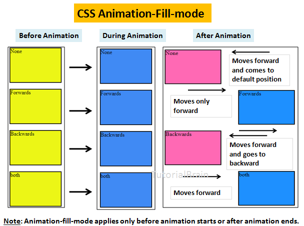
The animation-fill-mode property changes the style of an element before the animation begins or after the animation ends.
In simple words, the animation-fill-mode property decides the state of the element before the animation starts and after the animation ends.
It decides the position from where an element should start and end the animation. It can take any one of these 4 values –
- none – This is the default fill mode where there is no animation before the start of the animation or after the end of the animation. So, the element style will return to its original state which was present before the animation started.
- forwards – The style depends on the direction set by the last keyframe. This depends on the animation-direction and the animation-iterative-count. It takes the last keyframe i.e.last stage of the animation and applies this to the element at the end of the animation. So, the element will remain at the final position which depends on the last keyframes. It will not return back to its original state which was present before the animation started.
- backwards – This style depends on the animation-direction property of the starting keyframe. This applies to the target element retained by the animation-delay. So, it takes the 1st keyframe and applied this to the element at the start of the animation. At end, it will return back to its original starting point.
- both – The animation will extend in both the fill mode i.e. forwards and backwards.
The Syntax of Animations Fill Mode:
animation-fill-mode: none| forwards| backwards| both;
Example of Animations Fill Mode
div {
   position:relative;
   width:100px;
   border:2px solid black;
   background:hotpink;
   height:50px;
   text-align:center;
   line-height:50px;
   -webkit-animation-duration:6s;
   animation-duration:6s;
   -webkit-animation-name:val1-fillmode;
   animation-name:val1-fillmode;
   animation-delay:2s;
}
.none{animation-fill-mode: none;}
.forwards{animation-fill-mode: forwards;}
.backwards{animation-fill-mode: backwards;}
.both{animation-fill-mode: both;}

@keyframes val1-fillmode {
   0% {background-color:yellow;transform:translateX(60px);}
   25% {background-color:aqua;transform:translateX(120px);}
   50% {background-color:green;transform:translateX(180px);}
   100% {background-color:orange;transform:translateX(240px);}
}
Above Example Explained Step by Step
The original state of the div has –
background-color - hotpink
The div starts from the extreme left when it is in original state
1.animation-fill-mode: none
The element will come back to its original state after the animation ends and the element will come back to its original state which was present before the animation started.
So, after the animation ends:
background-color - hotpink
The div starts from the extreme left when it is in original state
2.animation-fill-mode: forwards
After the animation ends, the element will be in the state which is set in 100% or the last keyframe.
So, at 100%:
background-color:orange;
transform:translateX(240px);
so, after the animation Ends, the state of this div will be:
background-color:orange;
transform:translateX(240px);
3.animation-fill-mode: backwards
Before the animation starts, the element will be in the state which is set in 0% or the first keyframe. After the animation ends, the div will come back to its original state which was present before the animation.
So, at 0%:
background-color:yellow;
transform:translateX(60px);
so, before the animation starts, the state of this div will be:
background-color:yellow;
transform:translateX(60px);
The original state before animation started was -
background-color - hotpink
The div starts from the extreme left when it is in original state
So, after the animation Ends, the state of this div will be:
background-color - hotpink
The div starts from the extreme left when it is in original state
4.animation-fill-mode: both
Before the animation starts, the element will be in the state which is set in 0% or the first keyframe. After the animation ends, the div will at the state which is set by the last keyframe or 100%.
So, at 0%:
background-color:yellow;
transform:translateX(60px);
so, before the animation starts, the state of this div will be:
background-color:yellow;
transform:translateX(60px);
The state set by the last keyframe(100%) was -
background-color - orange
The div starts from the extreme left when it is in original state
So, after the animation Ends, the state of this div will be:
background-color:orange;
transform:translateX(240px);
6. Animations Loop
Let us decide, how many loops you require for the animation.
The animation-iterative-count property sets the number of times the animation will repeat.
The Syntax of Animations Loop:
animation-iterative-count: n| infinite;
‘n‘ can take a value greater than 0.
infinite – Repeats the animation for an infinite time which means the animation keeps on running forever.
Example of Animations Loop
img {
  position:relative;
  width:200px;
  height:200px;
  -webkit-animation-name:val1-loop;
  animation-name:val1-loop;
  -webkit-animation-duration:5s;
  animation-duration:2s;
  animation-iteration-count:infinite;
}

@-webkit-keyframes val1-loop {
  50% {width:300px;}
}

@keyframes val1-loop {
 50% {width:300px;}
}
7. Animation-Play-State
The animation-play-state property controls if the animation is playing currently or paused.
Either, the animation state is – running or paused
The Syntax of Animations-Play-State:
animation-play-state: running| paused| inherit;
Example of animation-play-state
img {
  position:relative;
  width:200px;
  height:200px;
  -webkit-animation-name:val1-play-state;
  animation-name:val1-play-state;
  -webkit-animation-duration:5s;
  animation-duration:2s;
  animation-iteration-count:infinite;
  animation-play-state:running;
}

@-webkit-keyframes val1-play-state {
  50% {border-radius:50%}
}

@keyframes val1-play-state {
 50% {border-radius:50%}
}
8. Animations Shorthand
The animation property is the shorthand for animation-name, animation-duration, animation-timing-function, animation-delay, animation-iterative-count, animation-direction, animation-fill-mode, animation-play-state
The Syntax of Animations Shorthand:
animation: animation-name animation-duration animation-timing-function animation-delay animation-iterative-count animation-direction animation-fill-mode animation-play-state;
Example of Animation Shorthand
div {
  background-image:linear-gradient(to top right, lawngreen, dodgerblue);
  position:relative;
  width:200px;
  height:200px;
  border-radius: 100%;
  animation: shorthand-val 4s ease-in 2s 3 reverse;
  -webkit-animation: shorthand-val 4s ease-in 2s 3 reverse;
}

@-webkit-keyframes shorthand-val {
  from {top:200px;}
  to {top:0px;}
  }

@keyframes shorthand-val {
  from {top:200px;}
  to {top:0px;}
}
Other animations examples
Let us see some other examples of CSS animations.
a) Animations On Hover
Let’s create animation on mouse hover
Example of Animations On Hover
.animation-val {
 border:2px solid black;
 width:200px;
 height:200px;
 background-color:deepskyblue;
}

@-webkit-keyframes firstanimation {
 from {border-radius:30%;}
 to {border-radius:50%;}
}

@keyframes firstanimation {
 from {border-radius:30%;}
 to {border-radius:50%;}
}

.animation-val:hover {
 -webkit-animation-name:firstanimation;
 animation-name:firstanimation;
 -webkit-animation-duration:1s;
 animation-duration:1s;
 -webkit-animation-iteration-count:5;
 animation-iteration-count:5;
}
b) Animations Transition
Let’s use CSS transitions with animations –
Example for Animations Transition
div {
  border:2px solid black;
  background-color:coral;
  width:100px;
  height:100px;
  -webkit-animation-name:val1-transition;
  animation-name:val1-transition;
  -webkit-animation-duration:5s;
  animation-duration:5s;
}

@-webkit-keyframes val1-transition {
  from {transform:rotate(90deg)}
  to {transform: scale(1,.5); background-color:deepskyblue;}
}

@keyframes val1-transition {
  from {transform:rotate(90deg)}
  to {transform: scale(1,.5); background-color:deepskyblue;}
}
c) Animations Rotate
Let’s use the rotate() function with animation
Example of CSS Animations Rotate
div {
  position:relative;
  background-color:dodgerblue;
  left:40px;
  width:200px;
  height:200px;
  -webkit-animation-name:val1-rotate;
  animation-name:val1-rotate;
  -webkit-animation-duration:5s;
  animation-duration:2s;
  animation-iteration-count:infinite
}

@-webkit-keyframes val1-rotate {
  0% {transform:rotate(30deg);}
  100% {transform:rotate(360deg);}
}

@keyframes val1-rotate {
 0% {transform:rotate(30deg);}
 100% {transform:rotate(360deg);}
d) Animations Text
Let’s animate the text-
Example of Animations Text
h3 {
   position:relative;
   text-align:center;
   font-size:2em;
   -webkit-animation-name:text-animation-val;
   animation-name:text-animation-val;
   -webkit-animation-duration:5s;
   animation-duration:2s;
   animation-iteration-count:infinite;
}

@-webkit-keyframes text-animation-val {
   0%   {font-size:3em; text-shadow: 4px 4px 2px rgba(0,0,0,0.8);}
  30%  {font-size:4em; text-shadow: 3px 4px 2px rgba(255,28,28,1);}
  60%  {font-size:5em; text-shadow: 3px -5px 4px rgba(28,59,255,1);}
  100% {font-size:6em; text-shadow: 0px 7px 3px rgba(70,179,24,1);}
}

@keyframes text-animation-val {
  0%   {font-size:3em; text-shadow: 4px 4px 2px rgba(0,0,0,0.8);}
  30%  {font-size:4em; text-shadow: 3px 4px 2px rgba(255,28,28,1);}
  60%  {font-size:5em; text-shadow: 3px -5px 4px rgba(28,59,255,1);}
  100% {font-size:6em; text-shadow: 0px 7px 3px rgba(70,179,24,1);}
}
e) Animations Transform3D
Let’s use the translate3d function with animation
Example of CSS Animations Tranform3D
div {
 width:200px;
 height:200px;
 background:lightgreen;
 position:relative;
 border:5px solid black;
 -webkit-animation-name:val1-transform;
 animation-name:val1-transform;
 -webkit-animation-duration:5s;
 animation-duration:2s;
 animation-iteration-count:infinite;
}

@-webkit-keyframes val1-transform {
 from {-webkit-transform: translate3d(50px, -25px, -35px);}
 to {-webkit-transform: translate3d(250px, -35px, -125px);}
}

@keyframes transform {
 from {transform:translate3d(50px, -25px, 35px);}
 to {transform:translate3d(150px, -35px, -125px);}
}
f) Animations Circle-Border
Let us create a circle border
Example of Animations Circle-Border
div {
   position:relative;
   border:2px solid black;
   width:200px;
   height:200px;
   margin-left:50px;
   border-radius:50%;
   -webkit-animation-name:val-circle;
   animation-name:val-circle;
   -webkit-animation-duration:5s;
   animation-duration:5s;
   animation-iteration-count:infinite;
}

@-webkit-keyframes val-circle {
   0% {left:0px; transform:rotate(0deg);}
   100% {left:100px;transform:rotate(60deg); border-color:green;
}

@keyframes val-circle {
   0% {left:0px; transform:rotate(0deg);}
   100% {left:100px;transform:rotate(90deg); border-color:green;
}
Do you Know?
If you do not want to use animation property of CSS, there is a ready made solution available for you.
There is a tool called Animate.css. It contains library which will create great animations without writing code for animations.
To get started with Animate.css, follow these steps –
- Go to Animate.css.
- Click on download Aniamate.css.
- Download this file to a folder which can be included in your head section.
- Just follow the documentation which is present here – https://github.com/daneden/animate.css