CSS Background
The background property is the shorthand which consists of multiple properties –
- background-color
- background-image
- background-position
- background-size
- background-repeat
- background-origin
- background-clip
- background-attachment
1. CSS Background Color
The background-color sets the color of the Background.
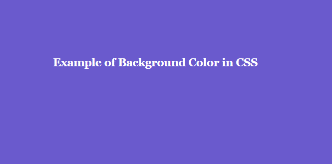
The Syntax of Background color:
background-color:color;
color can be the actual color name, hexadecimal code (like #FFFFFF), RGBA values, HSL values etc. Visit our tutorial on CSS Colors to master it in detail.
Example of CSS Background color
body {
 background-color:slateblue;
}

h2 {
 color:white;
 font-size:2em;
}
Background Color for div
Let us set the background-color for a div.

Example to give Background color for div
div {
  height:200px;
  padding:12px;
  background-color:plum;
 }
CSS Background Color Opacity
The amount of transparency can be set for the background color using rgba values where r stands for Red, g stands for Green, b stands for Blue & a stands for Alpha. This Alpha is the opacity value which decides the degree of transparency.
For more details on Color Opacity, click on CSS Opacity tutorial and to get detail information about the colors, click on CSS Colors.

CSS Background Color for Table cells
Suppose, you want to set a particular color to all the rows of the table and a particular color to the heading of the table, then how can you do that?

Example to give Background Color for Table cells
table, th, td {
 border:3px solid darkslateblue;
}

tr {
 background:darkturquoise;
}

th {
 background:lightgreen;
}
2. CSS Background Image
The background-image sets an image at the Background.
You should set the width and height of the background image as well.

The Syntax of Background Image
background-image: url(path);
Example of CSS Background Image
body {
 background-image:  url(img/newborn-child-tutorialbrain.jpg);
}
Background Image Blur
To add a visual effect like a blur, it is better to use the filter property and set the filter as blur(valid length value). This helps in setting a blur effect.
If you want the background image more blurry, then set a higher value of blur else set a lower value of blur. The default value of blur is 0.

The Syntax Background Image blur:
filter:blur(length);
Example:
- filter:blur(2px);
- filter:blur(4px);
- filter:blur(1.5em);
Example of Background Image Blur
.img-blur{
  background-image:url(img/newborn-child-tutorialbrain.jpg);
  background-repeat:no-repeat;
  filter:blur(4px);
  background-size:contain;
  height:1000px;
 }
CSS Background Gradient
Let us create a Background gradient using the background-image property. Here, the direction of the gradient is top left.
If you do not know about CSS Gradients, click here to master it.

Example of Background Gradient
body, html {
 height: 100%;
 margin: 0;
}

div {
 background-image: linear-gradient(to top left,#C2D307,#0ED2DC);
 height: 100%;
 color:white;
}
3. Background Image Position
The background-position property sets the starting position of the background image. It is the combination of background-position-x & background-position-y.
If you omit background-position-y i.e. if you do not code any value for background-position-y, this will take the value as “center” by default.
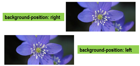
The Syntax of Background Image Position:
background-position:pos-x pos-y;
background-position:x-pos% y-pos%;
The different positions can be top, bottom, left, right & center.
You can even combine the different positions like –
background-position:20% 60%;
background-position:left top;
background-position:left bottom;
background-position:left center;
background-position:right top;
background-position:right bottom;
background-position:right center;
background-position:center center;
background-position:center top;
background-position:center bottom;
background-position:100px 120px;
background-position:inherit;
background-position:initial;
Let us take some examples of the background-position property.
Example of Background Image Position
.imgpos1{
  background-image: url(img/purpleflower.jpg);
  background-repeat:no-repeat;
  background-position:right;
  width:100%;
  height:250px;
  }

.imgpos2{
  background-image: url(img/purpleflower.jpg);
  background-position:left;
  background-repeat:no-repeat;
  width:100%;
  height:250px;
}
background-position-x.imgpos3{
  background-image: url(img/purpleflower.jpg);
  background-position:300px 50px;
  background-repeat:no-repeat;
  width:100%;
  height:450px;
}
CSS Align Background Image
You align the background image to the top, left, center, bottom, right, etc. So, let us try to align the background image to the center.
Example to Align Background Image
.img-posA{
  background-image:url(img/newborn-child-tutorialbrain.jpg);
  background-repeat:no-repeat;
  background-position:center;
  background-size:contain;
  height:200px;
 }
CSS Background Image Position x
The background-position-x helps to set the background position along horizontal direction only.
Example of Background Image Position x
.img-pos-x1{
  background-image: url(img/newborn-child-tutorialbrain.jpg);
  background-repeat:no-repeat;
  background-position-x:right;
  background-size:300px;
  height:250px;
  }
.img-pos-x2{
  background-image: url(img/newborn-child-tutorialbrain.jpg);
  background-position-x:center;
  background-repeat:no-repeat;
  background-size:300px;
  height:250px;
}
  .img-pos-x3{
  background-image: url(img/newborn-child-tutorialbrain.jpg);
  background-position-x:left;
  background-repeat:no-repeat;
  background-size:300px;
  height:250px;
}
CSS Background Image Position y
The background-position-y helps to set the background position along vertical direction only.
Example of Background Image Position y
.img-pos-y1{
  background-image: url(img/newborn-child-tutorialbrain.jpg);
  background-repeat:no-repeat;
  background-position-y:right;
  background-size:300px;
  height:250px;
 }

.img-pos-y2{
  background-image: url(img/newborn-child-tutorialbrain.jpg);
  background-position-y:bottom;
  background-repeat:no-repeat;
  background-size:300px;
  height:250px;
}

.img-pos-y3{
  background-image: url(img/newborn-child-tutorialbrain.jpg);
  background-position-y:60%;
  background-repeat:no-repeat;
  background-size:300px;
  height:250px;
}
Background Image Opacity
The background-image property can also use gradients using multiple RGBA color values in the direction(from-direction & to-direction) along with a url. To see details about CSS Gradients, click here.
Here, the opacity is applied to the Background Image but not on the text so this is Image opacity without affecting the text.

Example of Background Image Opacity
body{
 width:1000px;
 height: 500px;
 background: linear-gradient(rgba(255,255,255,.8), rgba(255,255,255,.4)), url("img/nature-girl-tiger.jpg");
 background-repeat:no-repeat;
 background-size:cover;
}
Background stripes
Let us create stripes in the Background. For this, you can simply use the background-image as repeating-linear-gradient.
If you are not familiar with CSS Gradients, click here to learn it.

Example of background stripes
body {
 background:repeating-linear-gradient(90deg,
 black,
 black 10px,
 white 5px,
 white 20px);
 }

h4 {
 color:hotpink;
 text-shadow:1px 2px gray;
 font-size:2em;
}
CSS Background Patterns
Let’s create a beautiful pattern using gradients.
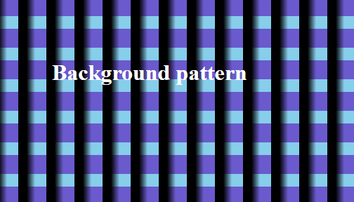
Example of Background Patterns
body {
 background-color:black;
 background-image: linear-gradient(90deg, black 30%, transparent 60%),
 linear-gradient(skyblue 40%, slateblue 0%);
 background-size:40px 45px;
}

h2 {
 font-size:2em;
 color:white;
}
4. Background size
You will notice that we have already used the background-size in the previous examples so let us understand it exclusively. The background-size controls the size of the background images.
The Syntax of Background Size:
background-size:length(value)| X%| auto| cover| contain
Sometimes, you need to set the width and height of images separately. This is possible by providing 2 values for the background-size as below –
background-size:300px 70%;
/*Width of image is 300px & height is 70% of the parent element */
background-size: auto 20%;
/*Width of image will be automatically assigned by browser & height is 20% of the parent element*/
Sometimes, it is difficult to say whether you should use background-size: cover or background-size: contain. In that case, remember that –
- background-size: cover makes the image as large as possible to cover the full area even if it has to stretch the image or cut the image at edges.
- Just try switching from background-size: cover to background-size: contain and vice-versa and see which works best for you.
Let us see some examples which use the background-size property.
Full-Screen Image
Suppose, we want our Background Image to cover the full size of the screen or full size of a particular container. The background-size: cover can help us to achieve this.

Example of Full-Screen Image
body, html {
  height: 100%;
  margin: 0;
}

div {
  background-image: url("img/nature-girl-tiger.jpg");
  height: 100%;
  background-position: center;
  background-repeat: no-repeat;
  background-size: cover;
}
Background Image Stretch
Let us stretch the background image using the background-size property.
Here we are using the background-size: 100% 100% to stretch the width and height to 100% of the parent element.

Example of Background Image Stretch
  .imgstr1{
    background-image: url(img/purpleflower.jpg);
    background-repeat:no-repeat;
    background-size:100% 100%;
    width:100%;
    height:250px;
  }

  .imgstr2{
    background-image: url(img/purpleflower.jpg);
    background-repeat:no-repeat;
    width:100%;
    height:250px;
  }
CSS Background Image Fit
The background-size: contain sets the background image to fit properly in the container or screen.
If your objective is to set the background image to cover the full area, then use background-size: cover.

Example of Background Image Fit
.bgfit{
  background-image:url(img/newborn-child-tutorialbrain.jpg);
  background-repeat:no-repeat;
  border:2px solid black;
  width:100%;
  height:500px;
  background-size:contain;
  background-position:center;
 }
5. Background Image Repeat
By default, the background image is repeated in horizontal(X axis) and vertical direction(Y axis). To control whether the Background image should repeat or not, you can use the background-repeat property.

The Syntax of Background Image Repeat :
background-repeat: repeat| no-repeat| repeat-x| repeat-y| space| round
- background-repeat: repeat means the background image should repeat in the horizontal and vertical direction. This is the default value. The image which does fit properly will be clipped
- background-repeat: no-repeat means the background image should not repeat in any direction
- background-repeat: repeat-x means the background image should repeat in only Horizontal direction(X-Axis)
- background-repeat: repeat-y means the background image should repeat in only Vertical direction(Y-Axis)
- background-repeat: space means the background image should repeat with even whitespaces around between the repeated images
- background-repeat: round means the background image should repeat and the background images will either squeeze or stretch around each other.
Example of Background Image Repeat
body{
 background-image: url(img/newborn-child-tutorialbrain.jpg);
 background-repeat:repeat;
 background-size:100px;
 height:250px;
}
Background Image No Repeat
Example of Background Image No Repeat
.bgimgval {
 background-image: url("img/nature-girl-tiger.jpg");
 height: 500px;
 background-repeat: no-repeat;
}
CSS Moving Background Image
To create a moving Background Image, you can use @keyframes and the animation property.
Example of Moving Background Image
@keyframes moveimage {
 from {background-position: 0 100;}
 to {background-position: -250px 0px;}
}

@-webkit-keyframes moveimage {
 from {background-position: 0 100;}
 to {background-position: -250px 0px;}
 }

.imgmoveval  {
 text-align:center;
 background-image: url('img/newborn-child-tutorialbrain.jpg');
 background-size: cover;
 height:550px;
 -webkit-animation: moveimage 10s linear 2;
 -webkit-animation-fill-mode: forwards;
 animation: moveimage 10s linear 2;
 animation-fill-mode: forwards;
}
Background Image Responsive
Background Images should be responsive and should look good in all type of devices.
To create a Responsive Background Image, follow this –
- Code background-attachment: fixed so that the Background Image is fixed in the viewport even if the content’s height is greater than the image height.
- Code background-position: center center so that the Background Image is vertically and horizontally centered.
- Code background-size: cover so that the Background Image covers the entire page. Alternatively, you can also code background-size: 100% 100%.
At the same time, you can also use media queries to use an image which has a smaller size so that it can load faster on smaller devices.
If you need a detailed level of knowledge on CSS media queries, click on this tutorial.
Example of Background Image Responsive
.resbg {
 background-image: url("img/nature-girl-tiger.jpg");
 background-repeat:no-repeat;
 background-size:100%;
 height:500px;
 color:white;
}
6. CSS Background Origin
The background-origin sets the origin of the positioning of the background image
The Syntax of Background Origin:
background-origin: border-box| padding-box| content-box| inherit;
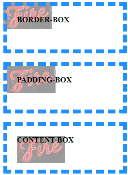
- background-origin:border-box sets the background image origin at the top-left corner of the border. So, in layman terms, it is the box at the top-left corner of the border
- background-origin:padding-box sets the background image origin at the top-left corner of the padding. So, in layman terms, it is the box at the top-left corner of the padding. This is the default value.
- background-origin:content-box sets the background image origin at the top-left corner of the content. So, in layman terms, it is the box at the top-left corner of the content.
Example of Background Origin
div {
 width:200px;
 height:60px;
 background: linear-gradient(rgba(255,255,255,.6),rgba(255,255,255,.6)), url("img/logo-neon-neon-light-2235130.png") no-repeat;
 border:8px dashed gray;
 padding:50px;
}

#bg-origin-border {
 background-origin:border-box;
}

#bg-origin-padding {
 background-origin:padding-box;
}

#bg-origin-content {
 background-color:darkgray;
 background-origin:content-box;
}
7. CSS Background Clip
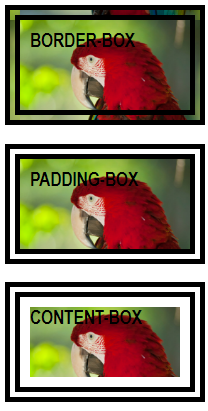
The background-clip controls how much the Background color or Background image will expand inside the element. So, it decides the stretching of element’s Background.
The Syntax of Background clip:
background-clip: border-box| padding-box| content-box| inherit;
- background-clip: border-box sets the background image’s stretching directly below its border box.
- background-clip: padding-box sets the background image’s stretching directly below its padding box.
- background-clip: content-box sets the background image’s stretching directly below its content box.
Example of Background Clip
h3 {
 width:h3 {
 width:150px;
 height:100px;
 background-image:url("https://i.ibb.co/6WKgPPZ/bird-one.png");
 border:15px double black;
 padding:10px;
}

#bg-clip-border {
 background-clip:border-box;
}

#bg-clip-padding {
 background-clip:padding-box;
}

#bg-clip-content {
 background-clip:content-box;
}
8. CSS Background Attachment
The background-attachment sets whether the Background Image will be fixed, scroll when the page will scroll or scroll when the content is scrolled.
- Code background-attachment: fixed if you want the Background Image to be fixed in the viewport even if the content’s height is greater than the image height or even you scroll
- Code background-attachment: scroll if you want the Background Image to scroll when the page is scrolled
- Code background-attachment: local if you want the Background Image to scroll when the content is scrolled
The Syntax of Background Attachment:
background-attachement: fixed| scroll| local;
Example of Background Attachment
.fixed-bg {
 top:10px;
 background-image:url("https://i.ibb.co/DG9BNqj/bird-two.png");
 width: 250px;
 height: 200px;
 background-repeat: no-repeat;
 background-position:0px 50px;
 background-color:orange;
 text-align:left;
 overflow:hidden;
 background-attachment: fixed;
 color:crimson;
 font-size:20px;
 padding-left:205px;
 border:2px solid black;
}
.scroll-bg {
 background-image:url("https://i.ibb.co/DG9BNqj/bird-two.png");
 width: 250px;
 height: 340px;
 overflow:auto;
 background-repeat: no-repeat;
 background-color:green;
 text-align:left;
 background-attachment: scroll;
 color:white;
 font-size:20px;
 padding-left:205px;
 border:2px solid black;
}
.local-bg {
 background-image:url("https://i.ibb.co/DG9BNqj/bird-two.png");
 width: 250px;
 height: 200px;
 background-repeat: no-repeat;
 background-color:yellow;
 overflow:auto;
 text-align:left;
 background-attachment: local;
 color:black;
 font-size:20px;
 padding-left:205px;
 border:2px solid black;
}
9. CSS Multiple background images
In the background, you can also add multiple images.
Here, we are just presenting an example but in actual production, you have to make sure that the images blend properly with each other.
Example of multiple background images
body {
 background-image: url(https://i.ibb.co/6WKgPPZ/bird-one.png), url(https://i.ibb.co/kXR6qrK/Hello.jpg);
 background-repeat: no-repeat, no-repeat;
 padding: 10px;
 color:white;
 height:200px;
}