CSS Gradients
Gradients helps to create a smooth texture by combining multiple colors in such a way that the element becomes uniformly smooth as you transition between nearest points.
There are 2 types of Gradients.
- Linear Gradient
- Radial Gradient
Let us understand both of these in detail.

1. CSS Linear Gradient
Linear Gradient is those that contain the gradient direction in straight lines and at least 2 colors which will blend together in a particular pattern. All those colors are required. The colors who participate in this are called Color Stops.
The default direction is Top to Bottom
The Syntax of Linear Gradient:
background-image: linear-gradient(direction, comma separated color stops) ;

-webkit-linear-gradient(...); /*chrome, safari */
-moz-linear-gradient(....); /* Mozilla */
-ms-linear-gradient(...); /* Internet Explorer */
-o-linear-gradient(...); /* opera */
An Example is shown for this at the end of this page.
Example of Linear Gradients
div {
 background-image: linear-gradient(deepskyblue, cyan, dodgerblue, navy);
 height: 200px;
 width: 320px;
 color:white;
}
CSS Linear Gradients To Bottom Right
You can set the gradient to Bottom right using the direction as – to bottom right.
The Syntax gradients to bottom right:
background: linear-gradient(to bottom right, comma separated color stops) ;
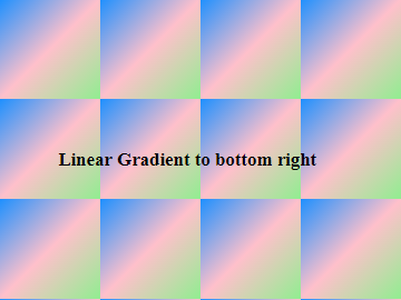
Example of Linear Gradients To Bottom Right
body{
 background: linear-gradient(to bottom right,dodgerblue, pink, lightgreen);
 background-size:100px 100px;
}
CSS Linear Gradients To Left
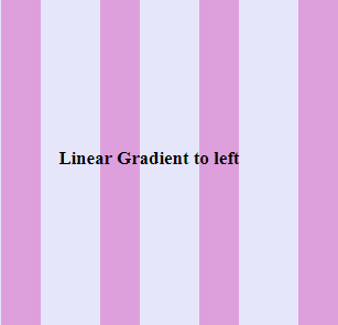
You can set the gradient to Left using the direction as – to left.
The Syntax gradients to left:
background: linear-gradient(to left, comma separated color stops) ;
Example of Linear Gradients To Left
.lin-left{
 background: linear-gradient(to left, lavender 60%, plum 40%);
 background-size:100px 100px;
}
Linear Gradients To Top Left
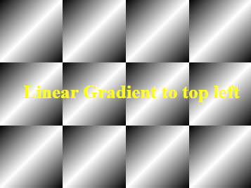
You can set the gradient to Top Left using the direction as – to top left.
The Syntax gradients to top left:
background: linear-gradient(to top left, comma separated color stops) ;
Example of Linear Gradients To Top Left
body{
 background: linear-gradient(to top left, black, white, black);
 background-size:100px 100px;
}
CSS Linear Gradients RGBA Values
We can define the color stops using rgba values as well.
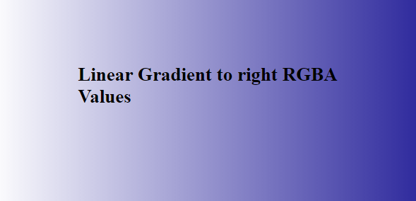
Example of Linear Gradients RGBA Values
body{
 background-image: linear-gradient(to left, rgba(255,20,147,1), rgba(165, 42, 42,0));
}
Repeating Linear Gradients
Sometimes, you might prefer to repeat the linear gradients. In that case, you can use the repeating-linear-gradient function.
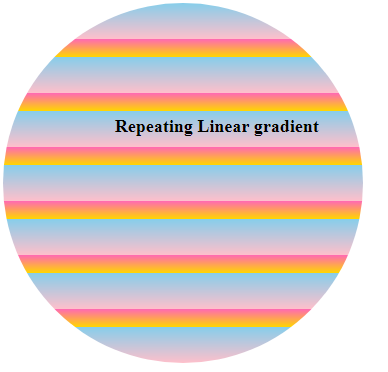
The Syntax of Repeating Linear Gradients:
background-image: repeating-linear-gradient(direction, comma separated color stops) ;
Example of Repeating Linear Gradients
.repeat-lin-grad {
 background-image: repeating-linear-gradient(skyblue, pink 10%, hotpink 10%, gold 15%);
 border-radius:50%;
 height: 400px;
 width: 400px;
}
Linear Gradients Repeating Border
To create a repeated pattern border around the element, you can simply use the repeating-linear-gradient function to create a repeating pattern of the linear gradient.

Example of Gradients Repeating Border
.border-repeat-grad{
  border: 10px solid;
  border-image:repeating-linear-gradient(60deg, lawngreen, blue 5px, blue 5px, lawngreen 20px);
  border-image-slice: 1;
 }
Set degree values for Linear Gradients
As linear Gradients are always straight so you can set this at a particular angle as well. To achieve this, you can simply use the direction value in angle like 20deg, -30deg etc.

Example of degree values for Linear Gradients
.lin-grad1 {
  background-image: linear-gradient(40deg,#51B8E8,#F566F2, #0D2E85, #4AAFE1);
  height:150px;
  width: 200px;
  color:white;
}
.lin-grad2 {
  background-image: repeating-linear-gradient(-70deg, dodgerblue 10%, lightgreen 15%);
  height: 200px;
  width: 200px;
  margin:15px;
}
Linear Gradient Text Color
The background:-webkit-linear-gradient(blue,red) sets the background image as linear gradient from Top to Bottom.
After this, you need to code -webkit-background-clip: text to set the background clip as text.
And at last, you need to code -webkit-text-fill-color: transparent to fill the text color as transparent so that it takes the linear background image as the color of the text.
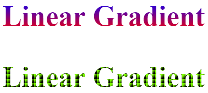
Example of Linear Gradient Text Color
h2 {
 background:-webkit-linear-gradient(blue,red);
 -webkit-background-clip:text;
 -webkit-text-fill-color: transparent;
 font-size:3em;
 }

h3 {
 background:linear-gradient(to top left, black 25%, deepskyblue 75%);
 background-size:10px 10px;
 -webkit-background-clip:text;
 -webkit-text-fill-color: transparent;
 font-size:4em;
 }
Linear Gradients Multi Colors
We have already seen that we can use multiple colors for Linear Gradients.
Let us create a beautiful background image using multiple colors.
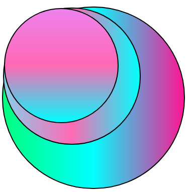
Example of Linear Gradients Multi Colors
.val1 {
 width:400px;
 border-radius:50%;
 height:400px;
 border:2px solid grey;
 background-image:linear-gradient(to left, deeppink, cyan, springgreen);
}

.val2 {
 border:2px solid grey;
 width:300px;
 border-radius:50%;
 height:300px;
 background-image:linear-gradient(to right, skyblue, hotpink, aqua);
}

.val3 {
 border:2px solid grey;
 width:250px;
 border-radius:50%;
 height:250px;
 background-image:linear-gradient(to top, cyan, hotpink, violet);
}
Diagonal Linear Gradients
To create a diagonal Linear Gradient, we need to set the starting side in X-axis(horizontal) and the starting side in Y-axis(vertical).
For example–
to top left
to bottom right
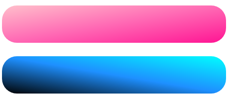
Example of Diagonal Linear Gradients
.lin-diagonal1 {
 height: 50px;
 width:300px;
 border-radius:20px;
 background: linear-gradient(to bottom right, pink, hotpink, deeppink);
}

.lin-diagonal2 {
 height: 50px;
 width:300px;
 border-radius:20px;
 background: linear-gradient(to bottom left, cyan, dodgerblue, black);
}
Similarly, for the 2nd div, the direction starts from top right and ends at the bottom left.
Linear Gradients Background Image
Along with a list of colors, you can also set a background image using the url(“path”) for the image.

Example of Gradients Background Image
body {
  background: linear-gradient(rgba(255,255,255,.8), rgba(255,255,255,.4)), url("img/newborn-child-tutorialbrain.jpg");
  background-size: cover;
}
Linear Gradients Border Bottom
Suppose, you have a heading and you want to apply a linear gradient to the border at the bottom.
In that case, you can simply use the border-image-slice property to controls how to slice the image in order to create a border. If you use this property, the image is sliced into nine parts – 4 corners, 4 edges, and the center.
For Example:
border-image-slice:1 /*It is 1px */
border-image-slice:4 /*It is 4px */
border-image-slice:20% /*20% relative to the width and height of the image */
border-image-slice:10% /*10% relative to the width and height of the image */
Example of Linear Gradients Border Bottom
.border-bot-grad{
  border-bottom: 10px solid;
  border-image: linear-gradient(to right, hotpink, lawngreen);
  border-image-slice: 1;
 }
2. Radial Gradients
The Radial Gradient is based on a central position. The direction of the gradient is not straight. It depends on the shape which it uses. The Radial Gradient must have at least 2 colors.

The Syntax of Radial Gradients:
background-image: radial-gradient(shape size position , comma separated colors) ;
The default shape is ellipse. The default size is farthest-corner and the default position is center.
Example of Radial Gradients
body, html {
 background-image:radial-gradient(pink, hotpink);
 height:100%;
}
Radial Gradients Farthest And Closest Sides
The farthest-side and closest-side controls the size of the shape of the radial gradient from each sides.
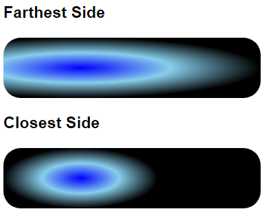
Radial Gradients Farthest And Closest Sides
.farthest-rad-grad {
 height: 70px;
 width:300px;
 border-radius:20px;
 background: radial-gradient(farthest-side at 30%, blue, skyblue, pink);
}

.closest-rad-grad {
 height: 70px;
 width:300px;
 border-radius:20px;
 background: radial-gradient(closest-side at 30%, blue, skyblue, pink);
 }
Radial Gradients Farthest And Closest Corners
The farthest-corner and closest-corner controls the size of the shape of the radial gradient from each corner.
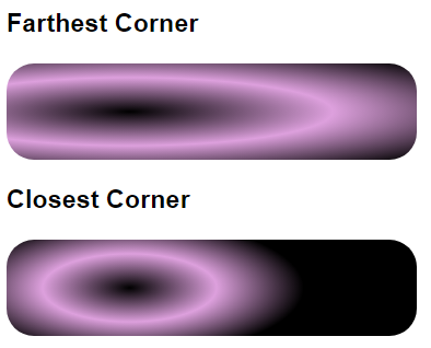
Example of Radial Gradients Farthest And Closest Corners
.farthest-corner {
 height: 70px;
 width:300px;
 border-radius:20px;
 background: radial-gradient(farthest-corner at 30%, black, plum, black);
}

.closest-corner {
 height: 70px;
 width:300px;
 border-radius:20px;
 background: radial-gradient(closest-corner at 30%, black, plum, black);
 }
Radial Gradients Circle And Ellipse
Let us use the shape as Circle and Ellipse and see how it looks.
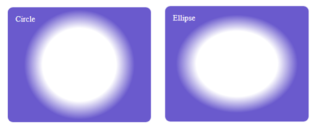
Example of Radial Gradients Circle And Ellipse
.cricle-grad {
 height: 200px;
 width:300px;
 padding:5px;
 border-radius:10px;
 background: radial-gradient(circle, white 40%, slateblue 60%);
}
.ellipse-grad {
 height: 200px;
 width:300px;
 padding:5px;
 border-radius:10px;
 background: radial-gradient(ellipse, white 40%, slateblue 60%);
}
Repeating Radial Gradients
The repeating-radial-gradient function repeats the Radial Gradients.
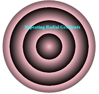
The Syntax of Radial Gradients Repeating:
background-image: repeating-radial-gradient(shape size position , comma separated colors) ;
Example of Repeating Radial Gradients
div {
 margin:15px;
 height:300px;
 width:400px;
 border-radius:100%;
 background: repeating-radial-gradient(pink 20%, black 40%);
}
Radial Gradients Text Color
The background:-webkit-radial-gradient(black 25%, deepskyblue 75%) sets the background image as Radial gradient as Ellipse, farthest corner and at the center. After this, you need to code -webkit-background-clip: text to set the background clip as text and at last, you need to code -webkit-text-fill-color: transparent to fill the text color as transparent so that it takes the linear background image as the color of the text.
This code is tested on Chrome browser. If you are using other browsers, then change the code accordingly. In production, you need to use -Moz-, -o-, -ms- for mozilla, opera or Internet Explorer respectively in place of -webkit-
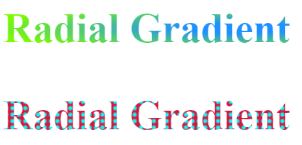
Example of Radial Gradients Text Color
h3 {
 background:-webkit-radial-gradient(black 25%, deepskyblue 75%);
 -webkit-background-clip:text;
 -webkit-text-fill-color: transparent;
 font-size:4em;
 }
Radial Gradients Border
You can also apply the border-image-slice property for Radial Gradient Border as well.
You can first set a border like –
border: 10px solid and then use the border-image-property with border-image-slice.

Example of Radial Gradients Border
.border-grad{
  border: 10px solid;
  border-image: radial-gradient(blue, plum);
  border-image-slice: 1;
 }
Gradients Cross Browser Compatibility
Gradients might not work in the older version of Internet Explorer like I.E 10 or prior. Similarly, you need to include browser specific code for Gradients. This code should work in Google Chrome, Safari, Opera, Mozilla Firefox and Internet Explorer.
Example of Gradients Cross Browser Compatibility
.radial-cross, .linear-cross {
 height: 250px;
 width:80%;
 text-align:center;
 padding:5px;
}

.linear-cross {
 background-image: linear-gradient(to top left,#1E90FF,#A9EE00);
 background-image: -webkit-linear-gradient(to top left,#1E90FF,#A9EE00);/*chrome, safari*/
 background-image: -moz-linear-gradient(to top left,#1E90FF,#A9EE00);/*Mozilla*/
 background-image: -ms-linear-gradient(to top left,#1E90FF,#A9EE00);/*Internet Explorer*/
 background-image: -o-linear-gradient(to top left,#1E90FF,#A9EE00);/*opera*/
}

.radial-cross {
 background-image: radial-gradient(circle, pink, yellow);
 background-image: -webkit-radial-gradient(circle, pink, yellow);/*chrome, safari*/
 background-image: -moz-radial-gradient(circle, pink, yellow);/*Mozilla*/
 background-image: -ms-radial-gradient(circle, pink, yellow);/*Internet Explorer*/
 background-image: -o-radial-gradient(circle, pink, yellow);/*opera*/
}