CSS Text Effects
By this time, we have already mastered the CSS Text properties like –
- Text Color (using color)
- Text Alignment (using text-align)
- Text Direction(using direction)
- Text bold (using tag)
- Text Size (using font-size)
- Text Line Height (using line-height)
- Space between words (using word-spacing)
- Space between Letters (using letter-spacing)
- Text Decoration (using text-decoration)
- Outline Text (using text-stroke)
- Indent the Text (using text-indent)
- Transform the text from lower to upper case and vice versa (using text-transform)
We also covered the shadow effects in detail like-
Let us master some Text Effects properties like
- word-wrap
- word-break
- text-overflow
- writing-mode
1. Word-wrap
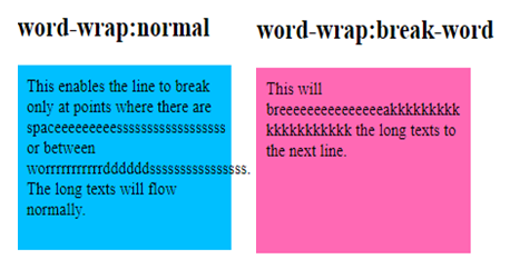
The word-wrap breaks the long words which are not able to fit in the same line to the next line.
word-wrap takes one of the following values –
- normal – This follows the normal word break rule.
- break-word – This breaks the long words which do not fit in the line to the next line so it wraps the long words in such a way that the extra letters flows in the next line.
- inherit – This gets the word-wrap property from its parent.

The Syntax of word-wrap:
word-wrap: normal| break-word| inherit ;
Example of word-wrap
#word-wrap-normal {
  background-color: deepskyblue;
  width: 200px;
  height: 150px;
  padding:10px;
}

#word-wrap-break {
  background-color:hotpink;
  width:200px;
  height:150px;
  padding:10px;
  word-wrap:break-word;
}
2. Word-break
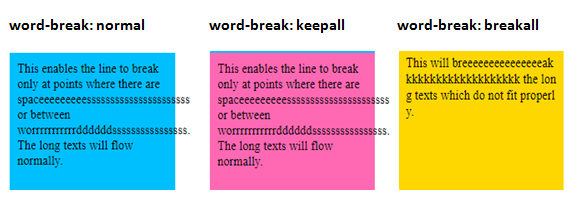
The word-break property specifies how words should break at the end of the line.
word-break takes one of the following values –
- normal – This does not break the long words into the next line. It goes with the flow and the text can go in the same line even beyond the container or div. The line will only break if there are white spaces or space between 2 consecutive words
- keep-all – For Chinese/Japanese/Korean (CJK) texts, do not use the word-break property at all. For other texts i.e. Non-CJK texts, the word break will be normal.
- break-word – Break the unbreakable words at arbitrary points to prevent the overflow
- break-all – Words should break between 2 characters to prevent the overflow.
- inherit – This gets the word-break property from its parent

The Syntax of word-break:
word-break: normal| keep-all| break-word| break-all| inherit ;
Example of word-break
#word-break-normal {
  background-color: deepskyblue;
  width: 200px;
  height: 150px;
  padding:10px;
  word-break:normal;
}

#word-break-keepall {
  background-color:hotpink;
  width:200px;
  height:150px;
  padding:10px;
  word-break:keep-all;
}

#word-break-breakall {
  background-color:gold;
  width:200px;
  height:150px;
  padding:10px;
  word-break:break-all;
}
3. text-overflow
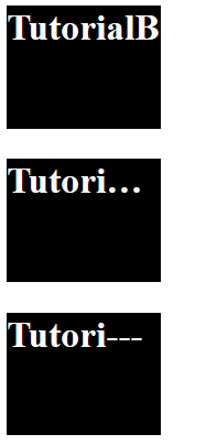
The text-overflow decides how the text will be displayed to the user in case the text overflows its boundary i.e. it decides whether to clip the text or show some dots etc.
This takes any one of these values –
- clip – This property clips(cuts) the overflowed texts
- ellipsis – In this case, there will be 3 dots(…) to show the clipped text
- string – The particular string will use the data type <string> to show the clipped text. This works on Firefox browser only. We do not advise to use this in production.
- inherit – The given element will acquire the text-overflow property from its parent
The text-overflow does not work on its own. You should code white-space: nowrap & overflow: hidden along with this.

The Syntax of text-overflow:
text-overflow: clip| ellipsis| string| inherit ;
Example of text-overflow
h2 {
 background-color: black;
 width: 100px;
 height: 80px;
}
#txt-clip {
 text-overflow:clip;
 color:white;
 white-space:nowrap;
 overflow:hidden;
}

#txt-ellipsis {
 text-overflow:ellipsis;
 color:white;
 white-space:nowrap;
 overflow:hidden;
}

#txt-string {
 text-overflow:"---";
 color:white;
 white-space:nowrap;
 overflow:hidden;
}
4. writing-mode
The writing-mode decides whether the text will be written in vertical or horizontal (horizontal-tb) direction.
If the direction of the writing is vertical, then it can also control if the writing will be from left to right direction(vertical-lr) or right to left direction(vertical-rl).

The Syntax of writing-mode:
writing-mode:horizontal-tb|vertical-lr|vertical-rl| inherit ;
Example of writing-mode
h2 {
 border:2px solid black;
  width:200px;
  height: 150px;
}
#tb {
  writing-mode:horizontal-tb;
}

#lr {
  writing-mode:vertical-lr;
}

#rl {
   writing-mode:vertical-rl;
}
This is the end of the tutorial on Text effects of CSS.
If you want to see a few more examples using text effects, then you can continue further else you can skip to the next page.
3D Text
By using the text-shadow, we are going to create a beautiful 3D text.
If you need a detailed knowledge of text-shadow , then this article is the best one.

Example of 3D-Text
h2 {
  font-size:85px;
  text-shadow:0px 0px 0 rgb(237,237,237),1px 1px 0 rgb(230,230,230),2px 2px 0 rgb(222,222,222),3px 3px 0 rgb(214,214,214),4px 4px 0 rgb(207,207,207),5px 5px 0 rgb(199,199,199),6px 6px 0 rgb(191,191,191),7px 7px 0 rgb(184,184,184),8px 8px 0 rgb(176,176,176),9px 9px 0 rgb(169,169,169),10px 10px 0 rgb(161,161,161),11px 11px 0 rgb(153,153,153),12px 12px 0 rgb(146,146,146),13px 13px 0 rgb(138,138,138),14px 14px 0 rgb(130,130,130),15px 15px 0 rgb(123,123,123),16px 16px 0 rgb(115,115,115),17px 17px 0 rgb(107,107,107),18px 18px 0 rgb(100,100,100),19px 19px 0 rgb(92,92,92), 20px 20px 0 rgb(84,84,84),21px 21px 20px rgba(0,0,0,1),21px 21px 1px rgba(0,0,0,0.5),0px 0px 20px rgba(0,0,0,.2);
}
Text glow effect
Now, let us create a glowing text using the text-shadow property.

Example of Text glow animation
h3 {
 font-size:10vw;
 color: white;
 background:#1F6097;
 text-align:center;
 text-shadow: 0 0 10px white;
}
Blinking text effects
We are going to create a blinking text effect by using CSS animation.
If you need a detailed knowledge of CSS animation, then this article is the best one.
Example of Blinking text effects
div {
  background:deepskyblue;
  font-size:25px;
  padding:10px;
 }

 h2 {
  position:relative;
  -webkit-animation-name:blink-txt;
  animation-name:blink-txt;
  -webkit-animation-duration:1s;
  animation-duration:1;
  animation-iteration-count:infinite;
 }

 @-webkit-keyframes blink-txt {
  0% {opacity:1;}
  50% {opacity:0;}
  100% {opacity:1;}
 }

 @keyframes blink-txt {
  0% {opacity:1;}
  50% {opacity:0;}
  100% {opacity:1;}
 }
Text fade
We are going to create a text fade out effect by using the CSS Animation.
Example of text fade
p {
   position:relative;
   color:navy;
   font-size:3em;
   -webkit-animation-name:text-fadein;
   animation-name:text-fadein;
   -webkit-animation-duration:5s;
   animation-duration:5s;
   animation-timing-function:ease-in;
}

@-webkit-keyframes text-fadein {
   0% {left:0px; opacity:1;}
   100% {left:200px; opacity:0;}
}

@keyframes text-fadein {
   0% {left:0px; opacity:1;}
   100% {left:200px; opacity:0;}
}
Text Typing Effects
Using the CSS animation, let us create a “Typing Text” effects.
Example of Text Typing Effects
h3 {
 font-family: consolas;
 font-size: 22px;
 white-space: nowrap;
 overflow: hidden;
 animation: type 3s steps(60, end);
}

@keyframes type {
 from { width: 0 }
 to { width: 100% }
}

@keyframes type2 {
 from { width: 0 }
 to { width: 100% }
}

span {
 animation: blink-txt 1s infinite;
}

@-webkit-keyframes blinkit {
 0% {opacity:1;}
 100% {opacity:0;}
}

@keyframes blinkit {
 0% {opacity:1;}
 100% {opacity:0;}
}
Text Mirror Effects
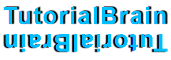
We are going to create a mirror effect of the text by using the transform property.

Example of Text Mirror Effects
h3 {
 font-family:helvetica;
 color:deepskyblue;
 letter-spacing:3px;
 font-size:3em;
 text-shadow:4px -1px 2px rgba(0,0,0,0.98);
 text-align:center;
}

.txt-mirror {
 text-shadow:4px -1px 2px rgba(0,0,0,0.98);
 position:relative;
 top:-50px;
 text-align:center;
 transform: rotate(180deg);
 -ms-transform: rotate(180deg);
 -webkit-transform: rotate(180deg);
}
CSS Text Moving Effect
Move texts show important information to the user.
Some of the websites contains a moving text before the header to show important information about an advertisement, an offer, etc.
Let us create that using the animation.
Example of Text Moving Effect
.animation-ex1 {
  position:relative;
  font-size:25px;
  -webkit-animation:txt-moving 5s linear infinite;
  animation:txt-moving 5s linear infinite;
}

@-webkit-keyframes txt-moving {
 0% {left:0;}
 50% {left:50%;}
 100% {left:100%;}
}

@keyframes txt-moving {
 0% {left:0;}
 50% {left:50%;}
 100% {left:100%;}
}
Text Rollover Effect
Let’s create a rollover effect using animation.
Example of Text Rollover Effect
h2 {
 background:hotpink;
 width:200px;
 font-size:2em;
 margin-bottom:5px;
 border-radius:10%;
 transition:transform 3s;
}

h2:hover {
 transform: rotate3d(2, -1, -1, 360deg);
 -webkit-transform: rotate3d(2, -1, -1, 360deg);
}