Grid Columns, Grid Rows and Grid Area
The grid-column property sets the width of the column of a grid item.
The grid-row property sets the height of the row of a grid item.
The grid-area property sets the area of a grid item. It consists of the width of the column & height of the row of a grid item.

Grid Column Start & Grid Column End
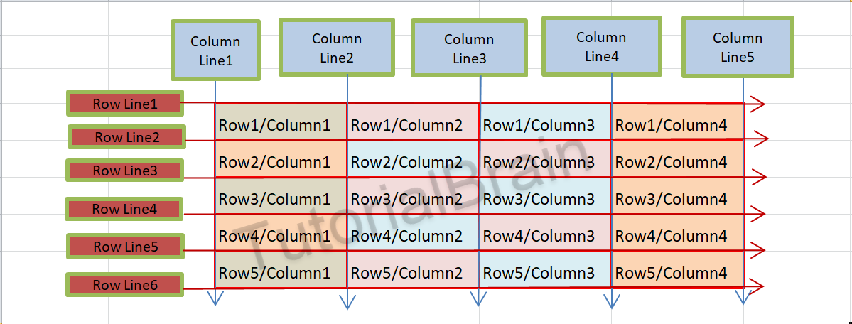
The Columns & Rows are different from Column Lines & Row Lines respectively.
In this image below, the number of Columns is 4 but the number of column Lines is 5. Similarly, the number of rows is 5 but the number of Row Lines is 6.
The grid column start & grid column end sets the starting column of the grid item & the ending column of the grid items respectively.
You can control –
- On which column a grid item must start using grid-column-start property.
- On which column a grid item must end using grid-column-end property.
If you want a particular grid item to start in column line 1 & end in column line 4, then the syntax will be like –
The Syntax of grid column start & grid column end:
grid-column-start: 1;
grid-column-end: 4;

Example to show grid column start & grid column end
.main-container {
  display:grid;
  grid-template-columns: auto auto auto auto;
}

.inner-divs2 {
  padding: 2px;
  background:tomato;
  border:2px solid green;
  text-align:center;
}

.grid-item2 {
  grid-column-start: 2;
  grid-column-end: 5;
}

.grid-item3 {
  grid-column-start: 1;
  grid-column-end: 4;
}
Grid Row Start & Grid Row End
The grid row start & grid row end sets the starting row of the grid item & the ending row of the grid items respectively.
To decide-
- On which Row a grid item must start, use grid-row-start property
- On which row a grid item must end, use grid-row-end property.
Suppose, you want a particular grid item to start in row line 1 & end in row line 3, then the syntax will be like –
The Syntax of grid row start & grid row end:
grid-row-start: 1;
grid-row-end: 3;

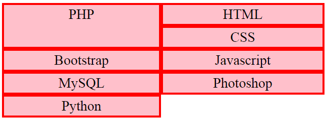
Example to show grid row start & grid row end
.main-container1 {
  display:grid;
  grid-template-columns: auto auto;
}

.inner-divs2 {
  padding: 2px;
  background:tomato;
  border:2px solid green;
  text-align:center;
}

.grid-item1 {
  grid-row-start: 1;
  grid-row-end: 3;
}
Grid Column
The grid-column property is the shorthand for grid-column-start and grid-column-end property.

Syntax of grid column:
grid-column: 1 / 3; /* Grid column starts at Column line 1 and ends at Column line 3 */
grid-column: 2 / span 3; /* Grid column starts at Column line 2 and spans 3 columns from column number 2 */
For Example:
grid-column: 1 / 3;
This is equivalent to grid-column-start:1 & grid-column-end: 3;
Example to show grid column
.main-container7a {
  display:grid;
  grid-template-columns: auto auto auto;
}

.inner-divs3a {
  padding: 2px;
  background:lightblue;
  border:2px solid silver;
  text-align:center;
}

.grid-item4a {
  grid-column: 1 / span 2;
}
Grid Row
The grid-row property is the shorthand for grid-row-start and grid-row-end property.

Syntax of grid row:
grid-row: 1 / 3; /* Grid row starts at row line 1 and ends at row line 3 */
grid-row: 2 / span 2; /* Grid row starts at row line 2 and spans 2 rows from row number 2 */
For Example:
grid-rows: 2 / 4;
This is equivalent to grid-row-start: 2 & grid-row-end: 4;
Example to show grid row
.main-container8 {
  display:grid;
  grid-template-columns: auto auto;
}

.inner-divs2a {
  padding: 2px;
  background:indianred;
  border:2px solid orange;
  text-align:center;
}

.grid-item5a {
  grid-row: 1 / 3;
}
Grid Area
The grid-area property is the shorthand for grid-row-start, grid-column-start, grid-row-end, & grid-column-end property.

Suppose, you want a particular grid item to start in Row line 2 & column line 3 & end in row line 5 & column line 5, then the syntax will be like –
Syntax of grid area(type 1):
grid-area: 2 / 3 / 5 / 4;
It is same as:
grid-row-start: 2; grid-column-start: 3; grid-row-ed: 5; grid-column-end: 4;
Syntax of grid area(type 2):
grid-area: 2 / 3 / span 3 / span 1; and it is same as grid-area: 2 / 3 / 5 / 4;
This means, the starting row Line is 2 & starting column Line is 3. Now, the browser needs to span 3 Row lines from Row line 2 which means the ending Row Line will be 5.
Similarly, the ending column line is span1 which means browser needs to span 1 column line from column line 3 so the ending column line will be 4.
Note/Info:
There is a space between span & the number. Ex- span1 is wrong while span 1 is right.
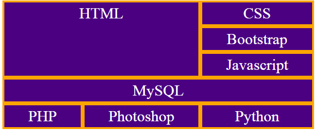
Example to show grid area for multiple grid items
.main-container-area1a {
  display:grid;
  grid-template-columns: auto auto auto;
}

.inner-divs2x {
  padding: 2px;
  background:tomato;
  border:2px solid green;
  text-align:center;
}

.grid-item1-area {
  grid-area: 1 / 1 / 4 / 3;
}

.grid-item6-area {
  grid-area: 4 / 1 / span 1 / span 3;
}
Grid Gap
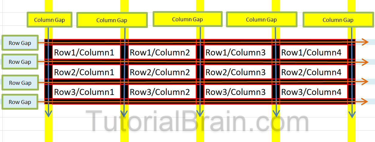
Gaps between rows or gaps between columns are optional.
The gaps (empty space) around 2 Rows are called Row Gaps and the gaps (empty space) around 2 Columns are called Column Gaps.
The grid-gap is a shorthand for grid-column-gap & grid-row-gap.

Syntax of grid gap:
grid-gap: grid-row-gap(value) grid-column-gap(value);
Example showing grid gap
.main-container-space {
  display:grid;
  grid-template-columns: 100px auto 120px 160px;
  grid-gap: 10px 20px;
  background:yellow;
  padding:10px 5px;
}
.inner-divitems {
  padding: 2px;
  background:tomato;
  border:2px solid green;
  text-align:center;
}
Grid Row Gap
The grid-row-gap property sets the gaps between 2 consecutive rows.

Example showing grid row gap
.main-container-row {
  display:grid;
  grid-template-columns: 100px auto 120px 160px;
  grid-row-gap: 25px;
  background:red;
  padding:10px 5px;
}
.inner-divrows {
  padding: 2px;
  background:lightblue;
  border:2px solid green;
  text-align:center;
}
Grid Column Gap
The grid-column-gap property sets the gaps between 2 consecutive columns.

Example showing grid column gap
.main-container-col {
  display:grid;
  grid-template-columns: 100px auto 120px 160px;
  grid-column-gap: 15px;
  background:pink;
  padding:10px 5px;
}
.inner-divcols {
  padding: 2px;
  background:aqua;
  border:2px solid yellow;
  text-align:center;
}