How to insert Charts in Google Slides
Charts are added to add a graphical representation of data.
It is a good practice to include a chart to represent statistics in your Google slides.
To show the Charts, go to Insert -> Chart.
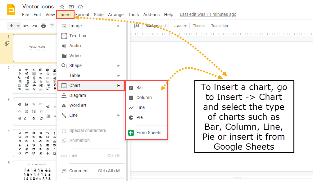
There are 4 types of charts that you can add in Google Slides –
- Bar
- Column
- Line
- Pie
You can directly insert the chart from Sheets using the last option ‘From Sheets‘ as shown in the above image.
Insert a Bar Graph
To insert Bar graph, choose ‘Bar‘.
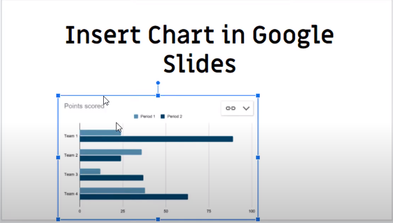
How to change the data inside the Bar Graph
You cannot directly use the above chart as it is a sample chart. Click on the ‘Linked Chart options‘ to edit the chart.
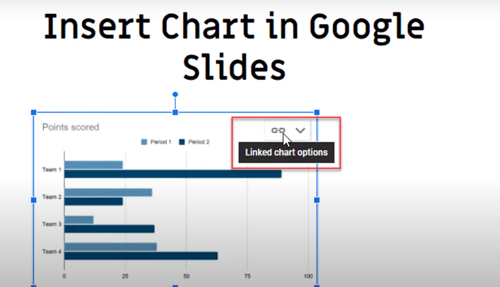
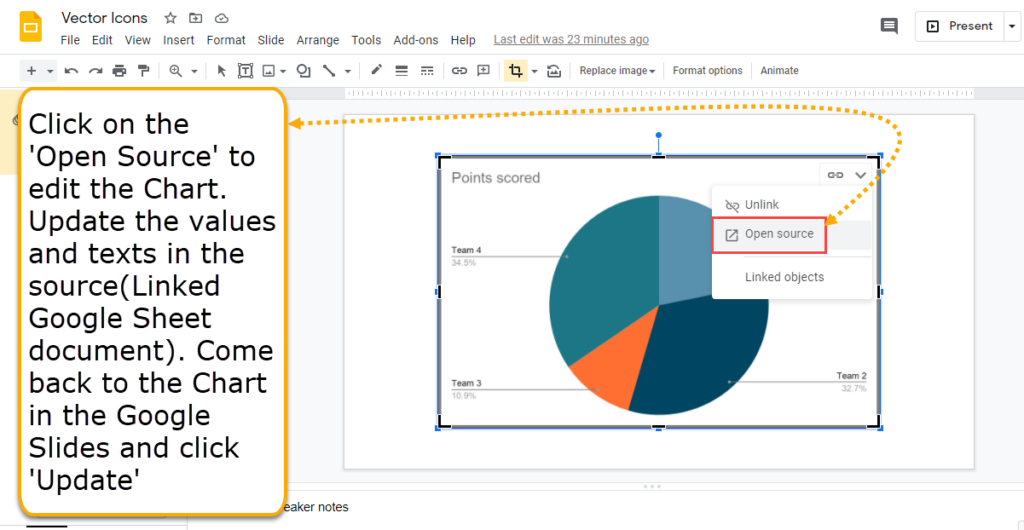
This opens the linked ‘Google Sheet‘ document which can be edited to get your exact chart.
You can edit the data of the chart in the google sheet.
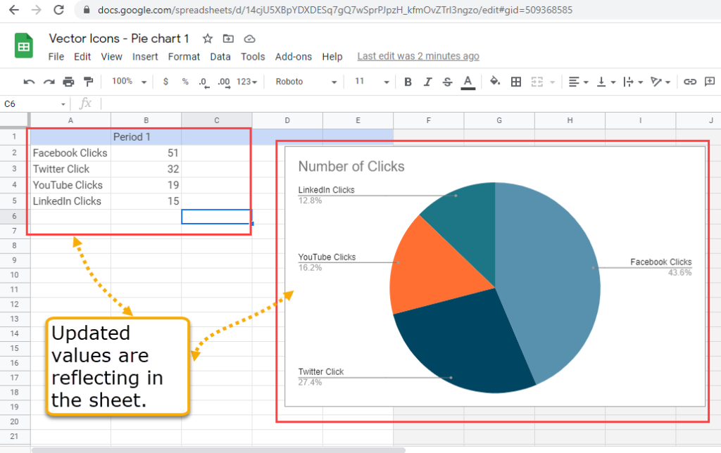
Update the Google Sheet as per your requirements. You can change the data inside the sheet or color of the chart. You can do a lot of changes such as deleting an entire column, or adding a new column, etc.
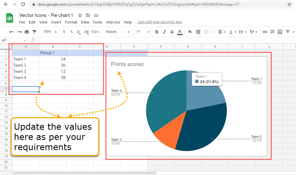
Updated values will be automatically saved and will reflect the changes in the Google Sheets.
After, you edit the data in Google sheet, you can come back to the google slides, you have an option to ‘Update’.
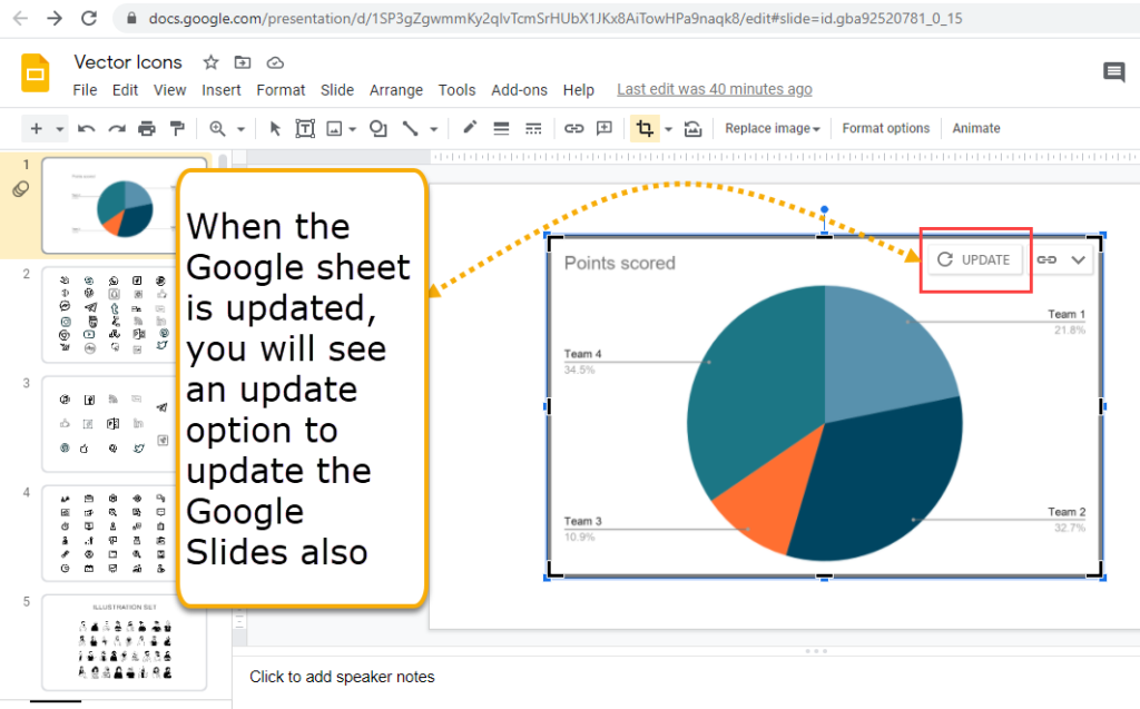
Click on the ‘Update’ to show the updated chart.
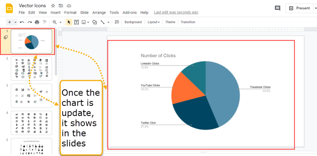
There are different ways to edit the chart. Watch this video to see how to edit the chart in details –